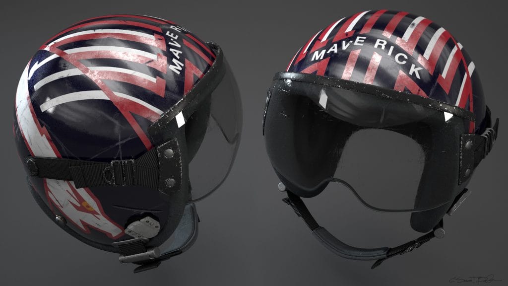
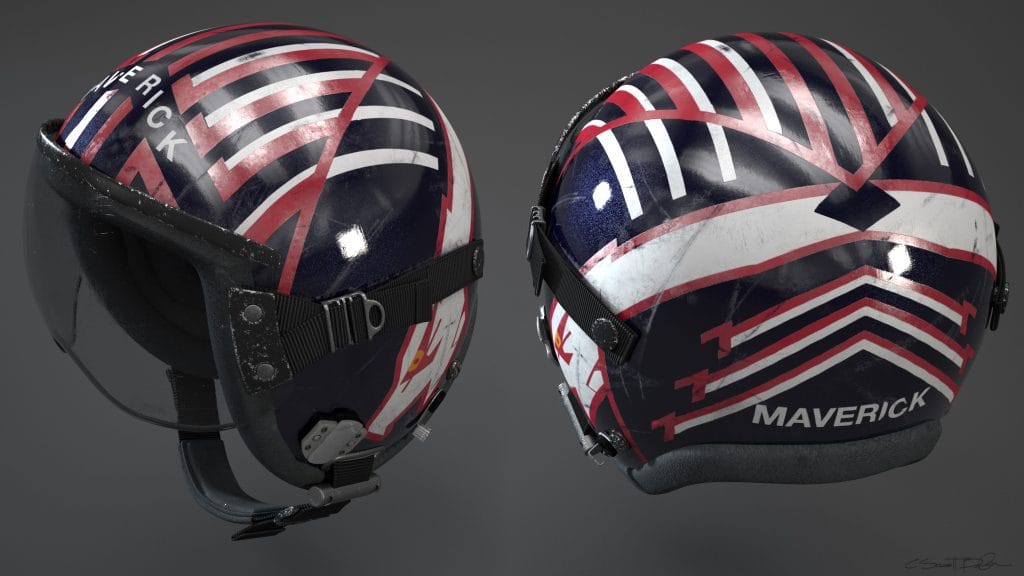
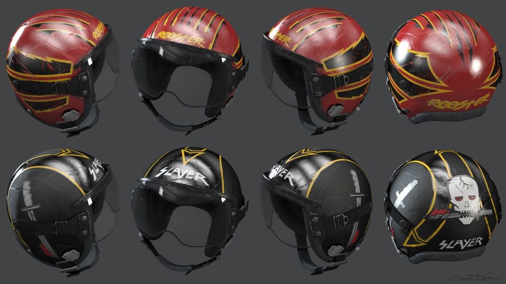
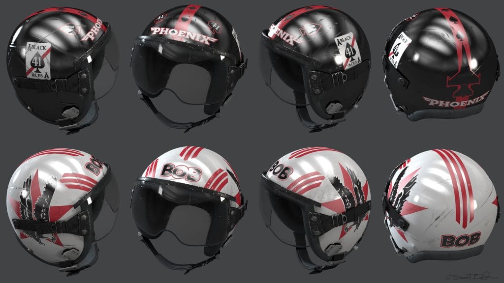
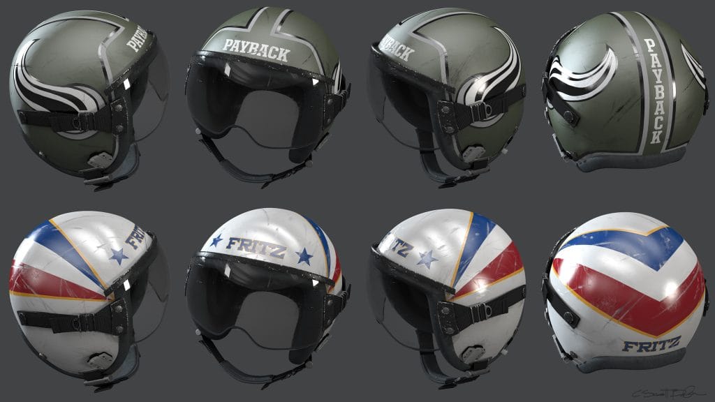
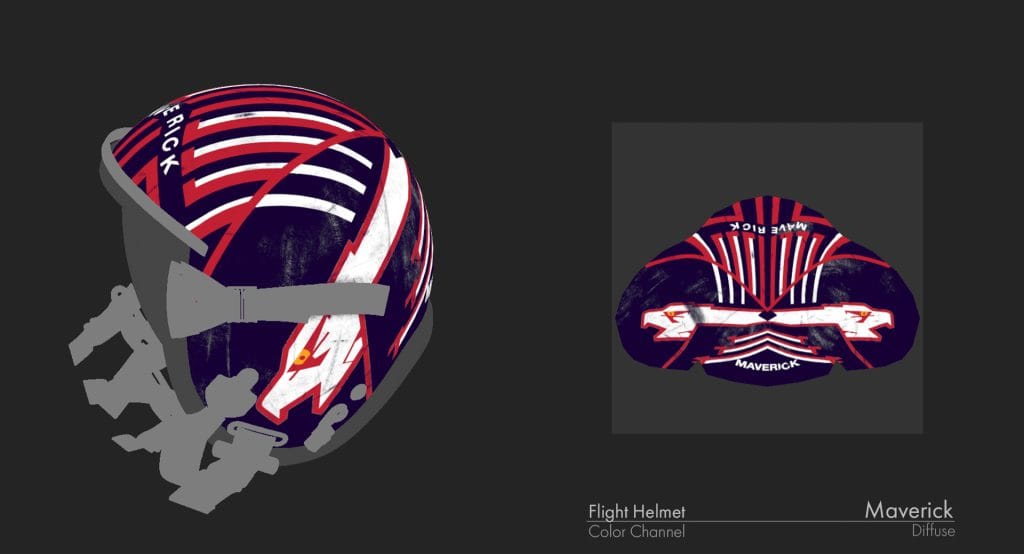
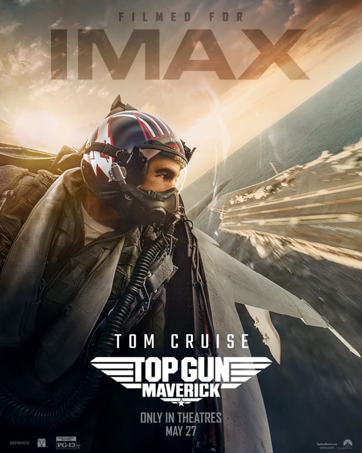
While working on Top Gun: Maverick, I was brought in to help visualize and develop helmet designs for the Production Designer- Jeremy Hindle and Director- Joseph Kosinski. They had a set of 2D graphics from the the amazingly talented Graphic Designer- Clint Shultz, but translating those flat concepts onto a curved 3D surface and making them feel real was a bit of a puzzle.
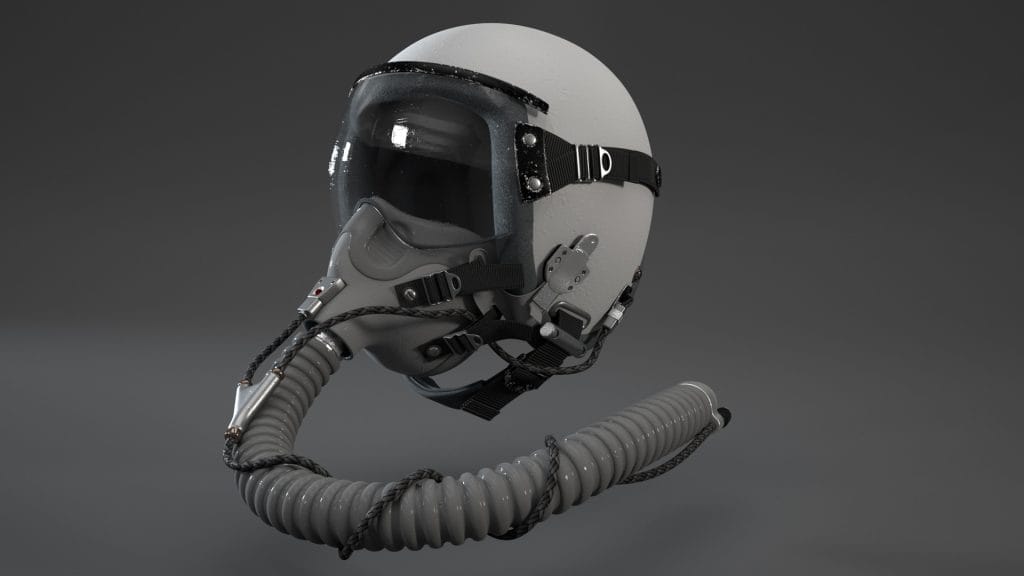
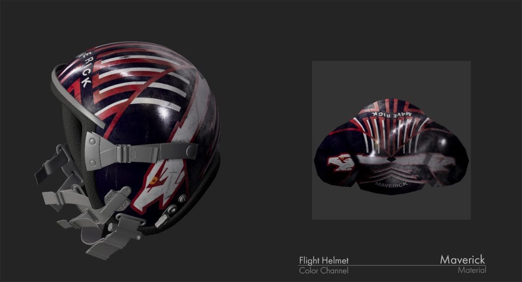
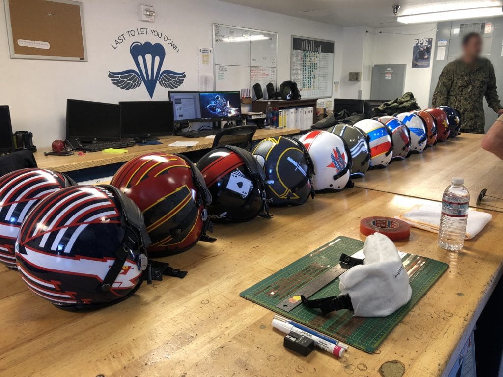
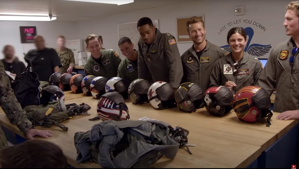
This turned out to be one of the most fun and creatively satisfying parts of the project. My designs became a key reference for the incredible scenic team, who used my images, animations, and breakdowns to replicate the look on the final hero prop helmets using paint and reflective tape.I started by modeling the F-18 flight helmet (the HGU-68/P) in Maya, laying out the UVs to maximize texel density and keep things clean for both Pre-Vis and eventual VFX handoff.
From there, I jumped into Substance Painter, where I built an aging and scuff material pass to sit above the graphics. This wasn’t strictly necessary for approvals, but I find a bit of realism goes a long way — scratches, smudges, and subtle wear help sell a prop as something functional and lived-in, not just decorative.
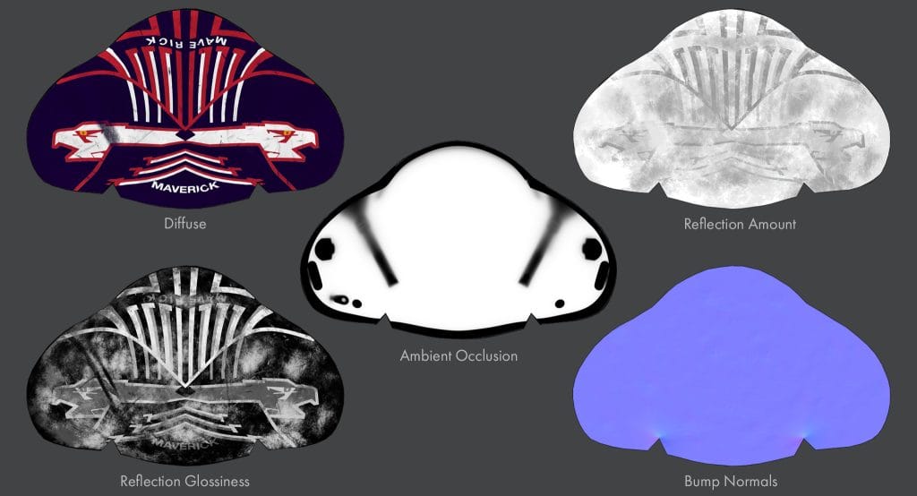
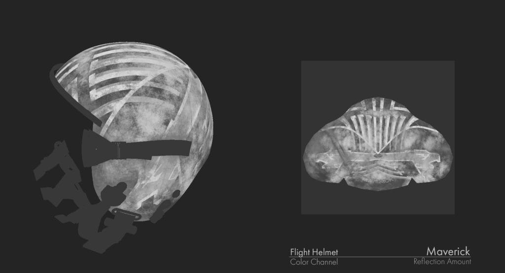
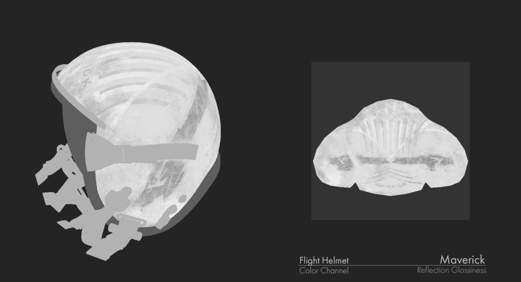
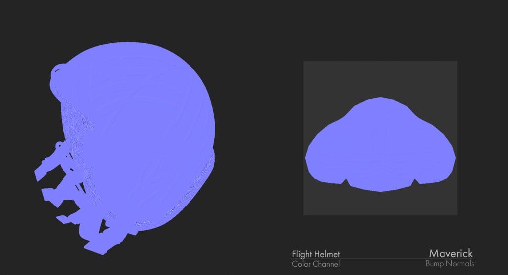
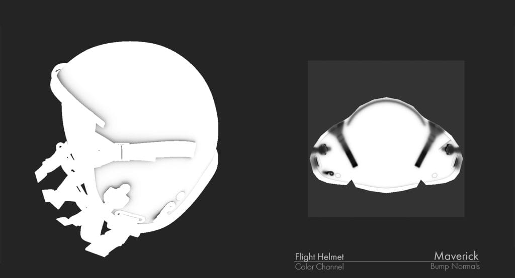
Then came the fun part: taking the 2D graphics and mapping them onto the helmet in 3D space. I created a full set of mapping channels in Photoshop — Color, Reflectivity, Glossiness, Normals, etc. — then brought those into Substance Painter to generate a working reference material. Smaller, more intricate elements were projection painted to preserve accuracy on tight curves, while larger features like stripes and lettering had to be manually plotted and painted by hand so they wrapped naturally around the form. The visor positions (up/down) made this especially challenging, it had to look good from both views without distortion.
Once painted, I baked the maps and built the final materials in Maya/V-Ray for high-quality stills and animation, which were used for design reviews and sign-off.
Each helmet went through several rounds of revisions, but because I had a streamlined workflow and kept everything well-organized, updating each version was fast and efficient.
I’m proud of how these turned out, not just because they look great, but because they became a small but memorable part of such a massive, iconic project. It was a great example of how digital tools, traditional craftsmanship, and clear communication all come together in the right hands.
